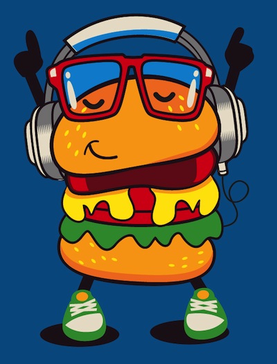
Pros & Cons of Using a Hamburger Menu
In this episode, Hayley and Theresa discuss UX trends, hamburger menus and the biggest challenges users have when navigating through a website. Tune in now, or download it to listen later.
Don’t want to listen? Read the transcription!
H: Welcome back to CGR Creative’s Oh, Snap! Marketing Podcast, where we spill out best kept marketing secrets in a snap. This is our second episode, and we’re so glad you’re joining us today. I’m Hayley, the content strategist over here at CGR, and today, I’ll be talking to Theresa.
Theresa, why don’t you tell everyone a little bit about yourself?
T: Hey, guys! My name’s Theresa. I’m the UI/UX designer here at CGR, and what that means is…UI stands for User Interface, and that’s pretty much the look and feel of your website or your graphics.
UX, on the other hand—User Experience—which is the analytical and technical side of your website. So that’s what I do around here.
H: Awesome! Theresa is on the show today to tell us about some current User Experience trends, one of which is hamburgers, which I think sounds pretty delicious, but I’m guessing has nothing to do with hamburgers.
T: Not quite!
H: I guess to begin, what are users already accustomed to when it comes to navigation on a website?
T: What users are accustomed to right now, just with a standard website, we’re looking at horizontal top menus. That’s when your menu’s at your top. And that’s what you kind of look for when you go to a website. And you have your vertical left side menu, which is located on the left side, and you can easily find what you’re looking for over there.
One of the positives to both of these is they’re easy to use. People are used to that location. There are lower bounce rates from websites because people aren’t trying to find the navigation. There are more pages per visit, and also, higher conversions, which is great.
*beep*
H: This is an interruption of your podcast to really fast tell you what a bounce rate is. According to Google Analytics, the bounce rate is the percentage of single-page sessions. This means sessions in which the person left your site from the entrance page, without interacting with the page. Okay, now where were we? Oh, yeah…hamburgers. Back to you, Theresa.
*beep*
T: As you mentioned earlier, our hamburger menu…
H: Yum!
T: Yes! Which also has been known as the hidden drawer. This hamburger menu is typically seen as the three-lined symbol located in the top left- or right-hand, where you’d typically find your normal menu. It was actually created in the 80s by a guy named Norm Cox.
H: Oh, wow!
T: Which is an interesting fact. It originated for mobile screens; because they’re so small, it’s hard to fit a long navigation onto a little 4-inch screen, so they originated the hamburger menu.
You just click that, and it reveals more content. That’s a new trend that people are starting to catch onto. We’re starting to see some positive and negative feedback from it.
H: I’m curious. So it started in the 80s. Why do you think it’s picking up speed now?
T: I just think, for UI reasons, it’s a cleaner look and feel. It really simplifies your page. You don’t have this long bar with x amount of navigation. It’s very customizable, too! If you want to go with a certain color scheme, you can customize it to that. If you want to have three circles instead of three lines, if you want to have a grid style—kind of like how Facebook has a grid style, hamburger menu—you can do that.
Also, you can see this trending on Twitter, Linked In, and many other website.
H: Cool. So what are some of the negatives you’re seeing from it?
T: Negatives. They say it’s hurting the UI of the site. Basically, hiding the navigation can make things less discoverable and visible—that’s not always good. For some of your older users, who aren’t really used to the trends, they’re looking for a menu, and they’re not finding them. When they do end up finding the navigation, it’ takes them a little longer, and they’re more likely to leave, which leads back to your bounce rate.
H: So we’ve got the hamburger trend. What other trends are you seeing?
T: I’m also seeing a trend with the hamburger menu slash using the actual word Menu. Some companies have combined the two, using the word Menu next to the hamburger, or just using the word Menu.
A recent study done by Conversion XL ran a test, and it showed that using the hamburger menu upped revenue 6%, while using the word Menu upped it 12%.
H: Oh, wow! That’s crazy!
T: Yeah! So hamburger menu versus using the term Menu, people are starting to see a little bit of a difference there.
H: And I’m kind of thinking…that makes a little bit of sense for me. Since I do a lot of the copywriting around here, I’m kind of thinking from a word’s standpoint, maybe the word Menu stands out as more of a call-to-action?
T: Yes, definitely a call-to-action. You have your visual people who can identify with the hamburger style, and then you have your analytical people who are looking for the word Menu.
H: Right.
T: They’re looking for that specific term to help them find the information that they need.
H: That’s really interesting. Well, which one do you think is best? What do you think is best for your site?
T: Personally, I love my UI, User Interface, look and feel. I love a clean design. I like the hamburger menu. I also think it’s important to have your hamburger menu for your overall basis of your site.
I think it’s important to have Contact and Location or Phone Number located somewhere outside of there, maybe next to it. I think that can also up the usability of your site.
H: Cool, Theresa! That’s really interesting. What do you think are some of the biggest challenges users might have when they’re navigating their way through a website?
T: What I’m seeing is…I mean, you do have your older generations, who are not as accustomed to using websites, so they are looking for that standard, traditional, top-of-the-website menu. When that’s not there, people aren’t able to find it. You know, you have your bounce rates, people are leaving your website.
Also, content. You have your site map, and people are looking for specific things, and they aren’t finding them in the navigation. Say you have five links—products, gallery—someone’s looking for something specific, and they’re not seeing a specific word. That’s another problem, too, when you do a basic Google search, your SEO should be on point, so that it leads you to that proper page, instead of you just ending up somewhere, and you’re kind of confused.
H: That makes a lot of sense. Okay, Theresa, so we’re talking a lot about menu structure and UX, so I guess my next question is does UX matter, and why does it matter?
T: UX definitely matters when it comes to building a website. UX has to do with your accessibility, your performance. It has marketing, utility, design aesthetics, usability—overall human interaction. This is really important to your website because, no matter how beautiful you have your website, if people aren’t able to find what they’re looking for, they aren’t going to be on your website for too long. Which is going to lead to your higher bounce rates, you’re going to have lower conversions. And you aren’t going to have a good reputation in the website field, that’s for sure.
H: Basically what you’re saying is, it doesn’t necessarily matter what a site looks like—or it does matter—but it’s just as important how people interact with it.
T: The design of your site definitely does matter, but to a degree because people need to be able to get to their information. Neglecting UX can actually result in a sloppy site, and people aren’t going to come back to a sloppy site. You want to make sure you have good content, depending on what kind of stuff you’re sponsoring, you want to have good imagery. You don’t want to have a ton of stock photos. It looks fake; people aren’t trusting your website.
You want to have a comfortable website, clean, great content. Short, simple. You want the user to feel comfortable on your website, especially if it’s an eCommerce site. People are going to be giving you money. You don’t want someone not feeling comfortable giving your business money, when you know you’re a reputable business.
H: I’ll be really honest with everyone here. UX is Theresa’s knowledge base, which is why I’ve had so many questions for her. I’m actually Googling some statistics about UX right now, and I found a really interesting one.
It says that 39% of people will stop engaging with a website if images won’t load or take too long to load. Which I’m sure is a factor of UX.
T: Definitely! You need to make sure your website has the proper dimensions for your images. If you’re uploading, for example, a 4,000 x 2,000 image, into a 2,000 x 1,000 space, your image is going to come through, but it’s going to take time to load. And people just…with our fast internet speeds now, people aren’t waiting a minute or two minutes to see an image. They’re going to get off your website and find another one where they can find what they’re looking for.
H: Expectations are definitely a lot higher. And this one’s really interesting to me, too. 44% of website users will leave the website if there’s no contact information or phone number.
T: Yep! Absolutely! I mean, if they’re on your website to contact you, and they can’t find that right away, if it’s not on your homepage, or if you don’t have a link for contact, they’re going to leave your site.
H: Cool, Theresa. Thank you so much for sharing with us today!
Tune in to the full podcast to hear this episode’s Hot or Not segment, where we discuss current marketing trends and whether we think they’re hot…or not! In this episode, we discuss Facebook Live videos, Internaut Day, and…MySpace?